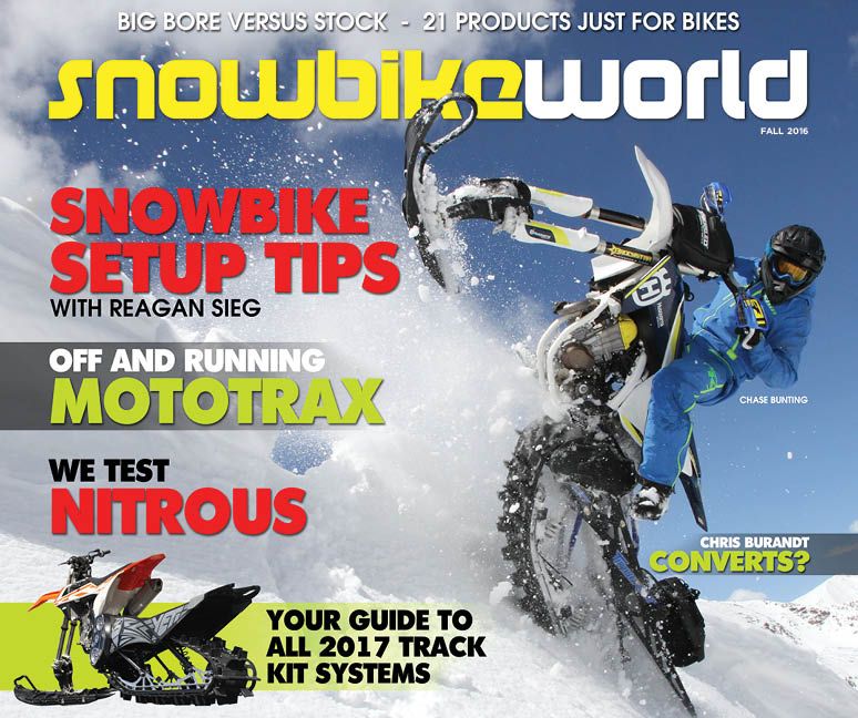
Nice work on the premiere issue!
I voted for portrait format. From a reading perspective, it's more user friendly (less paragraphs and jumping around) but that, of course depends greatly on whoever is laying out the content and images no matter the page orientation. The current snowest mag has a great layout which would serve snowbike mag equally well. Don't change it just to change it.
Other formatting observations I like...stay away from the old print style of continuing articles at the back of the mag. Very annoying. It's really nice to keep the continuity of all text and images, for one article, located together. This is particularly important in digital content because it's harder to skip 15 pages to get to the continuation.
Great work and keep it coming. Will those with paid lifetime snowest membership/subscription also get snowbike mag? Or will it require a seperate subscription?


